TYPOGRAPHY: TASK 1 - PRACTICAL TASK EXERCISES
Lee Rui Yen (0391797)
Typography (GCD62704)
Task 1: Exercise [20%]
Week 1- Week 6

1) TASK DESCRIPTION: Throughout the beginning and the middle of the semester, exercises will be prescribed one after the other. These exercises will aid and benefit you in your quest to gain theoretical and practical knowledge in Typography that will inform you and provide you with the necessary experience to take on the module’s tasks.
All exercises prescribed are to be completed and documented (labelled, dated, clean, clear & concise) in your e-portfolio.
The exercises are as follows:
1) Type Expression
2) Text Formatting
Table of Contents
Module Information PDF
Lecture Notes
Lecture 0- Introduction
- Typefaces
- Point size
- Line length
- Line spacing (also called leading)
- Letter spacing (tracking)
- Kernings (the space within letter pairs)
- Typesetters
- Compositors
- typographers
- graphic designers
- art directors
- manga artists
- comic book artists
- graffiti artists
Lecture 1- Development

|
| Figure 1.1 (Week 1, 20/4/2026) |

|
| Figure 1.2 (Week 1, 20/4/2026) |

|
| Figure 1.3 (Week 1, 20/4/2026) |

|
| Figure 1.4 (Week 1, 20/4/2026) |
Hand Script from 3rd - 10th century C.E.
- Square capitals were the written version that can be found in Roman monuments. These letterforms have serifs added to the finish of the main strokes. The variety of stroke width was achieved by the reed pen held at an angle of approximately 60 degrees off the perpendicular.
- A compressed version of square capitals, rustic capitals allowed for twice as many words on a sheet of parchment and took far less time to write. Then pen or brush was held at an angle of approximately 30 degrees off the perpendicular. Although rustic capitals were faster and easier to write, they were slightly harder to read due to their compressed nature.
- Both square and rustic capitals were typically reserved for documents of some intended performance. Everyday transactions, however were typically written in cursive hand in which forms were simplified for speed. We can see here in the beginning of what we refer to as lowercase letterforms.
- A further formalisation of the cursive hand, half-uncials mark the formal beginning of lowercase letterforms, replete with ascenders and descenders, 2000 years after the origin of the Phoenician alphabet.
- Charlemagne, the first unifier of Europe since the Romans, issued an edict in 789 to standardise all ecclesiastical texts. He entrusted this task to Alcuin of York, Abbot of St Martin of Tours. The monks rewrote the texts using both majuscules (uppercase), miniscule, capitalisation and punctuation which set the standard for calligraphy for a century.
-
Figure 1.5 (Week 1, 20/4/2026)

- Blackletter to Gutenberg's type
- With the dissolution of Charlemagne's empire came regional variations upon Alcuin's script. In northern Europe, a condense strongly vertical letterform known as Blackletter or textura gained popularity. In the south, a rounder more open hand gained popularity, called 'rotunda', The humanistic script in Italy is based on Alcuin's miniscule.
- Gutenberg's skills included engineering, metalsmithing, and chemistry. He marshalled them all to build pages that accurately mimicked the work of the scribe's hand - Blackletter of northern Europe. His type mold required a different brass matrix, or negative impression, for each letterform.
Text Type Development Timeline
- 1450 Blackletter - Earliest printing type, based upon the hand copying styles that were then used for books in northern Europe. (Cloister Black, Goudy Text)
- 1475 Oldstyle - Based on the lowercase forms used by Italian humanist scholars for book copying. (Bembo, Caslon, Dante, Garamond, Janson, Jenson, Palatino)
- 1500 Italics - Echoes contemporary Italian handwriting, the first italics were condensed and close-set, allowing more words per page.
- 1550 Script - Originally an attempt to replicate engraved calligraphic forms, it is not entirely appropriate in lengthy text settings. (Kuenstler Script, Mistral, Snell Roundhand)
- 1750 Transitional - A refinement of oldstyle forms, it was achieved in part because of advances in casting and printing. Thick ot thin relationships were exaggerated, and brackets were lightened. (Baskerville, Bulmer, Century, Time Roman)
- 1775 Modern - Represents a further rationalisation of oldstyle letterforms. Serifs were unbracketed, and contrast between thick and thin strokes extreme. (Bell, Bodoni, Caledonia, Didot, Walbaum)
- 1825 Square Serif / Slab Serif - Originally heavily bracketed serif, with little variation between thick and thin strokes, these faces responded to the newly developed needs of advertising for heavy type in commercial printing. The brackets were dropped as they evolved. (Clarendon, Memphis, Rockwell, Serifa)
- 1900 Sans Serif - Eliminated serifs altogether. Became widespread in the beginning of the twentieth century. Variations tended toward either humanist forms (Gill Sans) or rigidly geometric (Futura). Occasionally, strokes were flared to suggest the calligraphic origins of the form (Optima). Sans Serif is also referred to as grotesque and Gothic. (Akzidenz Grotesk, Grotesk, Gill Sans, Franklin Gothic, Frutiger, Futura, Helvetica, Meta, News Gothic, Optima, Syntax, Trade Gothic, Univers)
- 1990 Serif / Sans Serif - A recent development, this style enlarges the notion of a family of typefaces to include both serif and sand serif alphabets (and often stages between the two) (Rotis, Scala, Stone)

|
| Figure 1.6 (Week 1, 20/4/2026) |
Lecture 2- Text Part 1
- Kerning - Refers to the automatic adjustment of space between letters. It is often mistakenly referred to as 'letterspacing'.

|
| Figure 1.7 (Week 2, 27/4/2026) |
- Letterspacing - Refers to add space between the letters.
- Tracking - Refers to the addition and removal of space in a word or sentence. There is normal tracking, loose tracking and tight tracking.
- Normal Tracking - Easy to read and suitable to use in a large number of texts.
- Loose Tracking - Reduces readability and recognizability, thus not suitable for use in a large number of texts. But can be used in headlines in uppercase letterforms.
- Tight Tracking - Also reduces readability and recognizability, thus not suitable for use in a large number of texts.
-
Figure 1.8 (Week 2, 27/4/2026)

- Grey Value - The value of the entire text on a white page.
-
Flush Left - Most closely
mirrors the asymmetrical experience of handwriting. Each line
starts at the same point but ends wherever the last word on
the line ends. Spaces between words are consistent throughout
the text, allowing the type to create an even gray
value.
-
Centered Format - Imposes
symmetry upon the text, assigning equal value and weight to
both ends of any line. It transforms fields of text into
shapes, thereby adding a pictorial quality to material that is
non-pictorial by nature. Because centered type creates such a
strong shape on the page, its important to amend line breaks
so that the text does not appear too jagged.
-
Flush Right - Places emphasis
on the end of a line as opposed to its start. It can be useful
in situations (like captions) where the relationship between
text and image might be ambiguous without a strong orientation
to the right.
-
Justified - Like centering,
this format imposes a symmetrical shape on the text. It is
achieved by expanding or reducing spaces between words and
sometimes between letters. The resulting openness of lines can
occasionally produce 'rivers' of white space running
vertically through the text. Careful attention to line breaks
and hyphenation is required to amend this problem wherever
possible.

|
| Figure 1.9 (Week 2, 27/4/2026) |

|
| Figure 1.10 (Week 2, 27/4/2026) |
Leading and Line Length
- Type Size - Text type should be large enough to be read easily at arms length
- Leading - Text that is set too tightly encourages vertical eye movement; a reader can easily lose his or her place. Type that is set too loosely creates striped patterns that distract the reader from the material at hand.
- Line Length - Appropriate leading for text is as much a function of the line length as it is a question of type size and leading. Shorter lines require less leading; longer lines more. A good rule of thumb is to keep line length between 55-65 characters. Extremely long or short line lengths impairs reading.
A type specimen book shows samples of typefaces in various different sizes. Without printed pages showing samples of typefaces at different sizes, no one can make a reasonable choice of type. You only determine choice on screen when its final version is to read on screen.

|
|
Figure 1.11 (Week 2, 27/4/2026) |
Lecture 2- Typo 4 Text Part 2

|
|
Figure 1.12 (Week 3, 04/5/2026) |

|
| Figure 1.13 (Week 3, 04/5/2026) |
Widows and Orphans
- A widow is a short line of type left alone at the end of a column of text.
- An orphan is a short line of type left along at the start of a new column.

|
| Figure 1.14 (Week 3, 04/5/2026) |
In justified text, both widows and orphans are considered serious gaffes. Flush right and ragged left text is somewhat more forgiving towards widows, but only a bit. Orphans remain unpardonable.
Highlighting Text

|
| Figure 1.15 (Week 3, 04/5/2026) |

|
| Figure 1.16 (Week 3, 04/5/2026) |
Headline within Text
- A head indicates a clear break between the topics within a section. In the following examples 'A' heads are set larger than the text, in small caps and in bold. The fourth example shows an A head 'extended; to the left of the text.
- The B head here is subordinate to A heads. B heads indicate a new supporting argument or example for the topic at hand. As such they should not interrupt the text as strongly as A heads do. Here the B heads are shown in small caps, italic, bold serif, and bold san serif.
- The C heads, although not common, highlights specific facets of material within B head text. They do not materially interrupt the flow of reading. As with B heads, these C heads are shown in small caps, italics, serif bold and san serif bold. C heads in this configuration are followed by at least an em space for visual separation.

|
| Figure 1.17 (Week 3, 04/5/2026) |
Cross Alignment
Lecture 3- Typo 2 Basic
- Baseline - The imaginary line in the visual base of the letterforms.
- Median - The imaginary line defining the x-height of letterforms.
- X-height - The height in any typeface of the lowercase 'x'.
- Stroke - Any line that defines the basic letterform.
- Apex / Vertex - The point created by joining two diagonal stems (apex above and vertex below)
- Arm - Short strokes off the stem of the letterform, either horizontal (E, F, L) or inclined upward (K, Y)
- Ascender - The portion of the stem of a lowercase letterform that projects above the median.
- Barb - The half-serif finish on some curved stroke.
- Beak - The half-serif finish on some horizontal arms.
- Bowl - The rounded form that describes a counter. The bowl may be either open or closed.
- Bracket - The transition between the serif and the stem.
- Cross Stroke - The horizontal stroke in a letterform that joins two stems together.
- Crotch - The interior space where two strokes meet.
- Descender - The portion of the stem of a lowercase letterform that projects below the baseline.
- Ear - The stroke extending out from the main stem or body of the letterform.
- Em/En - Originally refers to the width of an uppercasee M, and em is now the distance equal to the size of the typeface (an em in 48 points, for example). An en is half the size of an em. Most often used to describe em/en spaces and em/en dashes.
- Finial - is the rounded non-serif terminal to a stroke.
- Leg - The short stroke off the stem of the letterform, either at the bottom of the stroke (L) or inclined downward (K,R)
- Ligature - The character formed by the combination of two or more letterforms.
- Loop - In some typefaces, the bowl created in the descender of the lowercase G.
- Serif - The right angled or oblique foot at the end of the stroke.
- Spine - The curved stem of the S
- Spur - The extension the articulates the junction of the curved and rectilinear stroke
- Stress - The orientation of the letterform, indicated by the thin stroke in round forms.
- Swash - The flourish that extends the stroke of the letterform.
- Tail - The curved diagonal stroke at the finish of certain letterforms.
- Terminal - The self-contained finish of a stroke without a serif. This is something of a catch-all term. Terminals may be flat ('T' above), flared, acute, ('t' above), grave, concave, convex, or rounded as a ball or a teardrop (see finial).

|
| Figure 1.18 |
Basic / The Font The full font of a typeface contains much more than 26 letters, to numerals, and a few punctuation marks. To work successfully with type, you should make sure that you are working with a full font and you should know how to use it.
- Uppercase - Capital Letters, including certain accented vowels, the c cedilla and n tilde, and the a/e and o/e ligatures.
- Lowercase - Lowercase letters include the same characters as uppercase.
- Small Capitals - Uppercase letterforms draw to the x-height of the typeface. Small Caps are primarily found in serif fonts as part of what is often called expert set. Most type software includes a style command that generates a small cap based on uppercase forms. Do not confuse real small caps with those artificially generated
- Uppercase Numerals - Also called lining figures, these numerals are the same height as uppercase letters and are all set to the same kerning width. They are most successfully used with tabular material or in any situation that calls for uppercase letters.
- Lowercase Numerals - Also known as old style figures or text figures, these numerals are set to x-height with ascenders and descenders. They are best used when ever you would use upper and lowercase letterforms. Lowercase numerals are far less common in sans serif type-faces than in serif.
- Italic - Most fonts today are produced with a matching italic. Small caps, however, are almost always only roman. The forms in an italic refer back to fifteenth century Italian cursive handwriting. Oblique are typically based on the roman form of the typeface.
- Punctuation, miscellaneous characters - Although all fonts contain standard punctuation marks, miscellaneous characters can change from typeface to typeface. It's important to be acquainted with all the characters available in a typeface before you choose the appropriate type for a particular job.
- Ornaments - Used as flourishes in invitations or certificates. They usually are provided as a font in a larger typeface family. Only a few traditional or classical typefaces contain ornamental fonts as part of the entire typeface family (Adobe Caslon Pro).
|
| Figure 1.19 |
Describing Typefaces
- Roman - The letterform is so called because the uppercase forms are derived from inscriptions of Roman monuments. A slightly lighter stroke in roman is known as 'Book'.
- Italic - Named for fifteenth century Italian handwriting on which the forms are based. Oblique conversely are based on roman form of typeface.
- Boldface - Characterized by a thicker stroke than a roman form. Depending upon the relative stroke widths within the typeface, it can also be called 'semibold', 'medium', 'black', 'extra bold', or super. In some typefaces (notably Bodoni), the boldest rendition of the typeface is referred to as 'Poster'.
- Light - A lighter stroke than the roman form. Even lighter strokes are called 'Thin'.
- Condense - A version of the roman form, and extremely condense styles are often called 'compressed'.
- Extended - An extended variant of a roman font.

|
| Figure 1.20 |
What is worth noting isn't the similarities but rather the differences - the accumulation of choices that renders each unique. Beyond the gross differences in x-height, the forms display a wealth of variety, in line weight, relative stroke widths and in feeling. For any typographer these feelings connote specific use and expression.

|
|
Figure 1.21 |
Lecture 5- Understanding

|
| Figure 1.22 |

|
|
Figure 1.23 |

|
| Figure 1.24 |

|
| Figure 1.25 |
X-height generally describe the size of the lowercase letterforms. However, you should keep in mind that curved strokes, such as in 's', must rise above the median (or sink below the baseline) in order to appear to be the same size as the vertical and horizontal strokes they adjoin.

|
| Figure 1.26 |
Its important to develop a sensitivity to the counterform (or counter) - the space describes, and often contained, by the strokes of the form. When letters are joined to form words, the counterform includes the spaces between them. The latter is particularly an important concept when working with letterforms like lowercase 'r' that have no counters per se. How well you handle the counters when you set type determines how well words hang together -in other words, how easily we can read what's been set. You should examine them in close detail. It provides a good feel for how the balance between form an counter is achieves and a palpable sense of the letterform's unique characteristics. It also gives you a glimpse in to the process of letter-making.

|
| Figure 1.27 |

|
| Figure 1.28 |
Contrast

|
| Figure 1.29 |

|
| Figure 1.30 |
Task 1: Exercise 1 Type Expression
1. Sketch
- Balance
- Smile
- Calm
- Clarity
- Hope
- Relax

|
| Figure 2.1, Week 2 (27/04/2026) |

|
|
Figure 2.2
|

|
|
Figure 2.3
|
2. Digitization

|
|
Figure 2.4, Week 3 (4/05/2026)
Balance (Figure 2.4, Top Left): This balance design is based on a weighing scale, with
the A moved below the line to act as the middle part of a
scale. I tried to use a font with equal widths to show
balance.
Clarity (Figure 2.4, Top Right): This clarity design uses the Gaussian Blur filter to
convey it's meaning, with the word gradually getting
clearer and thus having more clarity. I chose to use a
thick, large font to ensure that the word is more visible
after the Gaussian Blur, and set the initial blur settings
at around 8, with it gradually reducing after every letter
or so.
Smile (Figure 2.4, Bottom Right): This smile design is designed off of a real 'smile',
with the letters in different sizes to create a silhouette
of a smile. I chose to use that specific font as it seems
similar to teeth. I also had to adjust every individual
letter size to ensure that the silhouette looks
even.
Relax (Figure 2.4, Bottom Right): This relax design is based off of the idea of waves,
which are calming. The lines above and below the words are
meant to be the waves, and I adjusted the angle of every
letter except 'L' in the word 'Relax' to make it look like
the word is casually floating on some water.
|

|
|
Figure 2.5, Week 3 (4/05/2026)
Clarity (Figure 2.5, Top Left): This clarity design is based off of the suggestion from
Mr Vinod last week that clarity could be linked to
magnifying glasses, so I tried to create a magnifying
glass out of the font letters with minimal graphical
elements. I chose a font that made the 'C' in clarity more
rounded for the circular part of the magnifying glass, and
replaced the 'L' with an 'I' just to make the stem of the
magnifying class more clean. Finally, I added a curved
line inside the 'C' to replicate the glare of the glass. I
made the magnifying glass slanted to help with the
readability, although I'm not so sure if it translates
well because feedback from my friends say that it looks
more like a 'Q' than a 'CL'.
Clarity (Figure 2.5, Top Middle): Due to the fact that the previous design may be
misinterpreted as a 'Q' than a 'CL', I redesigned the same
clarity design as in Figure 2.5, but made the rest of the
word the 'stem' or the 'handle' of the magnifying glass.
That way, it is easier to identify the magnifying glass as
the 'C' in clarity.
Relax (Figure 2.5, Top Right): This relax design plays on my previously illustrated
design of something being so relaxed it almost topples
over. I stretched the top half of the word 'relax' and
added a shadow underneath the word to make it look like it
was leaning over.
Balance (Figure 2.5, Bottom Left): This balance design is based off of the idea of each
letter of the word balancing. I used a font that was thin
and minimal and tilted each word the same degree,
alternating tilting left and right equally. I quite liked
this design as it feels easy to read despite the
tiltedness of the letters.
Balance (Figure 2.5 Bottom Middle): This balance design is also based off of the idea of
the letters balancing, but I only made one letter balance
on it's edge. I chose the 'A' because it was in the middle
of the word, and chose a font that had a serif as a sort
of 'foot' for the letter to balance off of.
|
3. Feedback Adjustment

|
| Figure 2.6, Week 3 (4/05/2026) |
Animation

|
|
Figure 2.7, Week 4 (11/05/2026) |

|
|
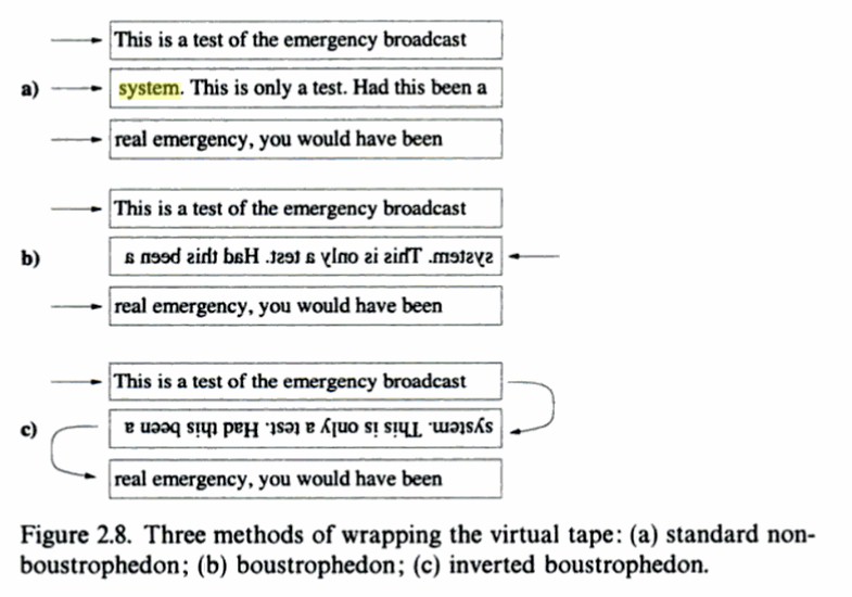
Figure 2.8, Week 4 (11/05/2026)
|
 | |
|
Exercise 1 Final Submission
- Final submission must include: one JPEG Grayscale (1024px width) @300ppi, one PDF and one Gif.

|
|
Figure 2.9, JPEG,
|
|
Figure 2.10, PDF, Week 4 (11/05/2026) |

|
Figure 2.11, Gif, Week 4 (11/05/2026) |
Task 1: Exercise 2 Text Formatting

|
|
Figure 3.1A, With Kerning, Week 5 (18/05/2026) |

|
|
Figure 3.1B, Without Kerning, Week 5 (18/05/2026) |

|
|
Figure 3.1C, Overlayed, Week 5 (18/05/2026) |
Practical Task: Exercise 2-Text Formatting

|
|
Figure 3.2, Week 5 (18/05/2026) |

|
| Figure 3.3, Week 5 (18/05/2026) |
Layout 1

|
| Figure 3.3, PNG, Week 5 (18/05/2026) |

|
| Figure 3.4, PNG, Week 5 (18/05/2026) |
Layout 1 Properties
Page Margins
Layout 2

|
| Figure 3.5, PNG, Week 5 (18/05/2026) |

|
| Figure 3.6, PNG, Week 5 (18/05/2026) |
Layout 2 Properties
- Font/s: Serifa Std 55 Roman
- Type Size/s: 10pt
- Leading: 11pt
- Paragraph spacing: 11
- Characters per-line: 60
- Alignment: Align Left
- Margins: 12.7mm (top + left + right), 100mm (bottom)
- Columns: 4
- Gutter: 5mm
Feedback Adjustment
New Layout 2

|
| Figure 3.7, JPEG, Week 5 (18/05/2026) |

|
| Figure 3.8, JPEG, Week 5 (18/05/2026) |
New Layout 2 Properties
- Font/s: Gill Sans Std Light
- Type Size/s: 10pt
- Leading: 11pt
- Paragraph spacing: 11
- Characters per-line: 63
- Alignment: Align Left
- Margins: 12.7mm (top + left + right), 100mm (bottom)
- Columns: 4
- Gutter: 5mm
Exercise 2 Final Submission
- Final submission must include 4 files: two PDFs (one with grid visible), two JPEGs (one with grid visible)
|
|
|
Figure 3.7, JPEG, Week 5 (18/05/2026) |
|
|
|
Figure 3.8, JPEG, Week 5 (18/05/2026)
|
Feedback from Lecturer
Reflection
Experience
Mr Vinod's classes are moderately intense, mainly because of the workload and the amount of revisions required after each critique. At the start of every lesson, we post our homework on Mr Vinod's Typography Facebook group for critique, and in almost every lesson, the feedback I receive leads me to adjust a large portion of my work afterward, which makes me feel overwhelming and time-consuming sometimes. But I understand that these critiques are an important part of the learning process.
Observation
Looking back at my earlier work, I'd like to believe that I see improvement in both my technical skills and design thinking. I realise that I often design based on gut instincts and must correct that by focusing on the basics of typographic design first in every project. Although it has been challenging, I am happy that I am learning a lot from my mistakes.
Findings
The lessons teach me to understand typography principles such as hierarchy, spacing, alignment, and composition. Overall, despite the difficulties, the class has been valuable because it continues to push me to grow and improve as a designer.
Further Reading
 |
| Image Source: The Art and Science of Typography in Design • Journalism University |
This article mainly dictates the spread of the Gutenberg's press throughout Europe as well as key elements of typography such as Typeface vs. Font, Serifs and Sans Serif typefaces and Typeface Anatomy, all of which has been covered already in the lecture videos. But it is good to learn about it from a different source as I may learn things I've never learned before.
Comments
Post a Comment